Multi-Measure Segment Charts
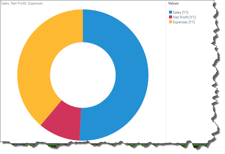
You can create multi-measure pie and doughnut charts in order to compare measures instead of elements. This is similar to a stacked measure chart, except that the measures are displayed as a proportion of a whole.
Multi-measure pie and doughnut charts are created by added multiple measures to the same axis in the Values drop zone. The measures are then automatically colorized, and displayed as segments of the chart.

How to Build a Multi-Measure Segment Chart
Multi-measure segment charts are only supported for pie and doughnut charts. Start by adding a measure to the chart.

Next, drag a second measure to the Values drop zone and drag it over the Values header to expose the advanced Values sub-menu. Drop the measure in the first column, labeled Pie/ Doughnut Chart and All.
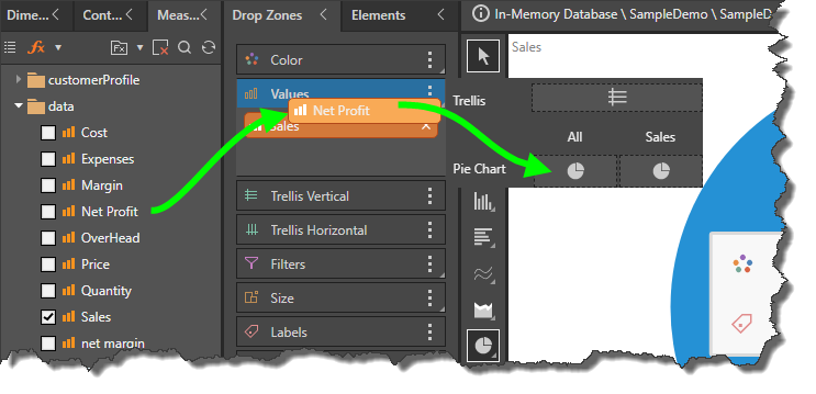
Alternatively, double click or checkbox select the required measure to add it to the Values zone; a Values chip will be generated and added to the Trellis Vertical zone automatically. Open the advanced Values sub-menu and add one of the measures to the All chart column (green arrow) and remove the Values chip from the Trellis zone (red highlight).

Both measures will be colorized automatically:
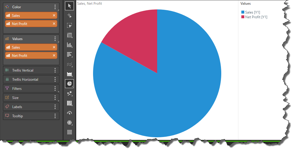
Continue added the required measures in the same way:

The multi-measure chart can be viewed as a pie or doughnut: